Archive for the ‘reviews’ Category

Sente, a first look

August 1st, 2011

Today I’ve been testing out Sente, on the theory that it might help me organize the PDFs I’m annotating on my iPad.

The desktop application is geared to Mac users who really care about bibliographies, with several fantastic features, including

I like Sente’s statuses; read/unread and Recently Modified and Recently Added are automatically tracked, and you can rate items. I especially like the workflow statuses, which match some of my common tasks:

  • Get Full Text
  • Discuss Further
  • Cite
  • Do Not Cite

“Sort by citation” is surprisingly illuminating: I didn’t realize how many papers from “Discourse Studies” I’d been looking at recently.

Another great feature that could be easily and fruitfully added to most other bibliographic managers: title case and exact case lists (I am *so* sick of seeing lowercased ‘wikipedia’ in bibliographies!), which you can very easily customize.
Sente also has a journal dictionary: You can assign the abbreviations and ISSNs (authority control, yippee!)!

Their visual display could use an update (thankfully it’s on the way) and I find their icons confusing (maybe ‘pencil’ for ‘note’ is sensible, but what in the world about ‘four dots in a diamond shape’ says ‘abstract’ to you?)

I tested the Zotero import. As I wrote Sente’s developers, there are some issues:

In testing it out on my large (5000+ item) Zotero library I see that:

  1. HTML attachments are not copied into the Sente library
  2. Image attachments are not copied into the Sente library
  3. Text note attachments are not copied into the Sente library
  4. Subcollections are not preserved

Since then, I’ve noticed that the keywords don’t get imported. Further, the date added and “date modified” fields are not preserved, but instead now reflect the import date and time (as I noted on twitter). But I do like their duplicate detection. Along with promising to consolidate matched items, they provide a report about the discarded matches. For instance:

Rule “DOI rule” flagged these two references as possible duplicates:
Vilar, P., & Žumer, M. (2008). Perceptions and importance of user friendliness of IR systems according to users’ individual characteristics and academic discipline. Journal of the American Society for Information Science & Technology, 59(12), 1995-2007. doi:Article
Quick-Response Barcodes. (2008). Library Technology Reports, 44(5), 46-47. doi:Article
However, the match was rejected because the references differ in: Article Title, pages, Publication Title, URL, Volume, Issue.

I have played briefly with the Sente’s free iPad viewer, but not yet with their paid ($19.99) app which allows annotation. Based on reviews (why no permalinks, Apple?), “Export seems to be an option but crucially, import is not.” However, if Sente’s annotation is enough, there’s hope, since documentation of the Sync functionality already in the current (6.2) version the description of Sync for the planned 6.5 release (via this) is *very* promising: “As you read a PDF on your iPad on the bus ride home, highlighting passages and taking notes, the highlighting and notes appear in all copies by the time you arrive home.”

By Sente user standards, I am far from a power user: the biggest databases seem to be about 10 times mine. This could be an improvement from Zotero, where my library speed can’t quite keep up some days. I’d be *very* interested to hear from enthusiastic Sente users. Switching seems quite feasible, and probably worth checking out their iPad app.

The main obvious concerns I have are about notetaking and portability. Notetaking of offline/non-fulltext items is important but doesn’t seem to have been a particular focus of development. Portability is incredibly important: I need to ensure that export (and ideally import) brings along files and notes as well as PDFs.

I’ve been thinking of direct, in-file PDF annotation as the best possible way to ensure that my annotations outlive my reference manager. Should I rethink that? So far (according to their draft manual as above): “Highlighting created in Sente 6.2 is not stored in the PDF itself — it is stored in the library database. This change has several very positive effects, notably on syncing.” Let me know what you think in the comments!
Tags: , , ,
Posted in books and reading, library and information science, reviews, scholarly communication | Comments (2)

Wolfram|Alpha Roundup

May 20th, 2009

I don’t usually go in for roundups. But the chatter about Wolfram|Alpha is so fun and so contradictory, I just had to collect it.

First, what is Wolfram|Alpha?

Let’s start with the tweets:

Working with WolframAlpha reminds me of playing Adventure, Zork and such- “I Wonder if phrasing it this way will work…”. Fun with NLP. – Geoffrey Bilder

wolframalpha thinks star trek is a movie, House (character) is unicode x2302, but is knows that the Boss is Bruce Springsteen – Eric Hellman

Onward to reviews. I’ll give you four types:

  1. “What can it do?”
  2. Mashable’s 10 Easter Eggs and 10 More

  3. “Incredible potential”
  4. James Hendler says:

    …a useful tool for some fields, and mainly a play toy beyond that — at least for now.

    But the potential is incredible. I really feel like it ushers in a new generation of Web applications and opens the door for getting people to realize that search is only the very beginning of what the Web is about.

    Jon Udell is hoping “to be able to compute with facts in a more frictionless way.”

  5. “Let’s improve it”
  6. Deepak Singh wants to enhance Wolfram|Alpha with structured data from other sources like Freebase and the Protein Data Bank.

    Google, Wikipedia, Wolfram|Alpha, two well established, and one nascent, but together, the three make quite a triumvirate of information, complementing each other well. Add to that sources like Freebase and we continue to move towards a world where information and knowledge at different levels gets increasingly accessible and available. The hope is that as that happens, we can solve new problems, and add to that knowledge at a broader scale than we ever have.”

  7. “All that hype for this“?
  8. Snark (what else?) from Ted Dziuba at The Register: Wolfram Alpha – a new kind of Fail

    In a more serious vein, David Weinberger sees Wolfram|Alpha’s Achilles’ heel:

Curation is a source of its strength. It increases the reliability of the information, it enables the computations, and it lets the results pages present interesting and relevant information far beyond the simple factual answer to the question. The richness of those pages will be big factor in the site’s success.

Curation is also WA’s limitation.

WA’s big benefit is that it answers questions authoritatively. WA nails facts down. …It thus ends conversation. Google and Wikipedia aim at continuing and even provoking conversation.

Buzz started in March, with raves from Nova Spivack and Doug Lenat. Rudy Rucker soon followed.

Wolfram|Alpha faviconI also really go in for the favicon.ico. Equals sign, check. Homage to Mathematica, check. Ahem.

See also: Google Squared lauching soon according to TechCrunch’s demo and Search Engine Land’s post.

Tags: , , ,
Posted in math, reviews | Comments (0)

Penguin US iphone app, and some thoughts on ebooks for iPhone

December 27th, 2008

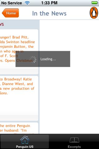
Penguin recently put out an iPhone app. It’s one part browser, one part ereader. It’s a reasonable start, but it feels rough around the edges. While I may try a later version, I’m deleting this app for now. I’d rather see publishers using existing ereaders and browsers, rather than building their own—especially for title sales, which they say is coming.

While I’m sure that the Penguin2.0 team is doing the best with what they have, they would do well to focus on getting in the flow, rather than trying to be a destination. Get listed by existing mobile ereader software: treat iPhone’s Stanza, Ereader, and BookZ and other ereaders as intermediate consumers.

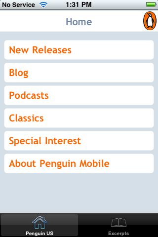
On to the details. The Penguin US app presents an array of options:

In fact, this page presents Penguin’s mobile site in their custom browser. (Note: to keep entry point URIs short, choose m, rather than mobile, for the subdomain.) Italics indicate suggestions from W3C mobile web best practices.

“Special Interest” may be an industry term, but I doubt it’s meaningful to most consumers (clarity). (It ranges from “African American” to “Short Reads”, and includes, for instance, “Current Affairs” and “Parenting”, BTW.)

Loading is v-e-r-y slow, even on wireless, going to subscreens… (Use the network sparingly.)

It’s slow going back home, too. (Are they providing caching information?) (Note 3 ways to get home from this screen: Besides the breadcrumb labeled ‘home’, and the global navigation in the lower left, the penguin icon in the upper right links to home. Cute, however provide only minimal navigation at the top of the page.)

Limit scrolling to one direction. Unfortunately, there’s quite a bit of whitespace in the margins.


This is the Classics page (scrolled overfar). The books themselves are at the bottom of this page (clarity, central meaning). I felt a bit disoriented at first, because news about classic titles is at the top of the page (e.g. Benjamin Button, a new production of All My Sons).

Podcasts sound great (capabilities). However, they do tie up the device (deficiencies).


The blog is not optimized for mobile viewing. For instance, there are missing plugins(deficiencies).


I’m sad that the Penguin Mobile ‘about’ page is just half a line overfull. (A pet peeve, clearly!) Perhaps the designers forgot about the service bar? Or tested in Safari (whose back button is smaller than the Penguin global navigation)? (testing)


It’s not all bad: Excerpts are always available, even without an internet connection. And I find this next screen charming: well-done!


In listing excerpts, they do keep with the color theme!


Excerpts start with a cover image and book information, pulled straight from a catalog, I presume. (limited, suitable) Tweaking formatting could make this more compact, with a more prominent title to next to, rather than below the cover image:


Scroll down to get to the first chapter:

It will be interesting to see how other publishers respond to the iPhone as an ebook platform. The Stanza free ereader for iPhone, for instance, currently has two publisher listings at the top of its online catalog: “Free Harlequin Love Stories” (4 novellas) as well as “Random House Free Library” (currently 9 recent titles, ranging from backlist massmarkets to summer and fall hardcover releases). Pan Macmillan (UK) is offering titles for purchase.

App name: Penguin US [appstore]
Maker: Penguin Group USA, web2.0
Cost: free
Quirks: Pages behave as fixed-width when zooming. Odd handling of double taps. Full-width is not used for excerpts in landscape mode.
Features: Free excerpts. Easy access to Penguin podcasts.

Posted in books and reading, iOS: iPad, iPhone, etc., reviews | Comments (0)

La Divina Commedia

November 29th, 2008

La Divina Commedia is another simple ebook application for the iPhone. Like Shakespeare, it provides free access to a classic read in its original language.

An attractive screen greets the reader:

Appropriately, it’s Domenico di Michelino‘s painting, Dante e suo poema (“Dante and his poem”).

Navigation is simple and straightforward, and mirrors the division of The Divine Comedy. Choose a canticle—Inferno, Purgatorio, or Paradiso—to get to Canto I of that section of the poem. Within each canto, scroll up and down (using default iphone behavior—there are no options or settings). Use arrow keys at the top right to get to the next (or previous) canto in the same section.

An info screen, accessible from the cover screen, gives credits:

If you ignore scrolling, that’s 102 screens!

App name: La Divina Commedia [appstore]
Maker: Stefano Sanna
Cost: free
Bugs: none found
Quirks: To navigate to a canto, you must scroll through the previous cantos; there’s no. Dante scholars often prefer to treat the first canto as introductory, and not part of the Purgatorio, making each canticle a neat 33 cantos. While scrolling follows iphone conventions, there is no scrolling; that limits the usability, especially if the font size doesn’t suit.
Features: A solid, free text of Dante’s famous work.
Other reviews: See comments at http://www.iphoneos.it/?p=3

Tags: , , ,
Posted in books and reading, iOS: iPad, iPhone, etc., reviews | Comments (0)

NYTimes Topics: Quirky, Useful Classification, Finding Aid

October 23rd, 2008

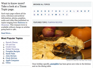
Yesterday the NYTimes announced a new API, TimesTags, “based on the taxonomy and controlled vocabulary used by Times indexers since 1851”. The browseable version of this vocabulary, http://topics.nytimes.com/ , is a great entry into NYTimes articles published since 1981.

NYTimes Topics

NYTimes Topics

Ed Summers did some scraping while also asking the Open NYTimes team for a SKOS version. Meanwhile, I’m playing around with the classification (online and scraped). Its quirks seem to reflect how it’s been used, and how it has evolved over time. Classification systems can highlight the material classified; they also tend to give insight into the worldview of the people classifying materials or creating the system. The interplay makes integration of classification systems, such as through topic maps, an interesting research area. But that’s a topic for another day.

Here are some things I’ve noticed while playing around with the vocabulary.

Overall Structure

The NYTimes’ main navigation lists 15 sections. The NYTimes taxonomy has 3 top-level categories: news, opinion, and reference. 7 sections fit within the news taxonomy. Opinion has its own category. Travel is an explicit subject within the reference category. Technology, arts, and style are topical, drawing primarily on the reference category. (Cooking, however, is similar to travel in its treatment.) The 3 advertising sections (jobs, real estate, and auto) are already classified, and thus, out of scope.

The remaining 7 sections we dub “news”. Here are examples of taxonomy terms, showing the category structure:

News

  1. World: international/countriesandterritories
    http://topics.nytimes.com/top/news/international/countriesandterritories/canada
  2. U.S.: national/usstatesterritoriesandpossessions/
    http://topics.nytimes.com/top/news/national/usstatesterritoriesandpossessions/michigan
  3. N.Y. / Region: newyork, newyorkregion
    http://topics.nytimes.com/top/news/newyorkandregion/columns/lens/

    http://topics.nytimes.com/top/news/nyregion/columns/clydehaberman/
    nyregion and newyorkandregion are both used, but they are not interchangeable (in the sense that there aren’t redirects)
  4. Business: business/companies
    http://topics.nytimes.com/top/news/business/companies/spicy-pickle-franchising-inc
  5. Science: science/topics
    http://topics.nytimes.com/top/news/science/topics/quasars

  6. Health: health/diseasesconditionsandhealthtopics
    http://topics.nytimes.com/top/news/health/diseasesconditionsandhealthtopics/amnesia
    As the name (diseases, conditions, health topics) suggests, this encompasses a wide range of topics: particular drugs such as Ritalin, categories of drugs such as antibiotics, topics such as smoking, sleep, teenage pregancy, and twins, and professional groups such as surgery and surgeons.
  7. Sports: sports, olympics
    http://topics.nytimes.com/top/news/sports/baseball/majorleague/philadelphiaphillies
    http://topics.nytimes.com/top/news/sports/probasketball/nationalbasketballassociation/atlantahawks

    Beyond sports, subcategory names vary considerably. Other sections, such as for the Olympics, are outside the main hierarchy:
    http://topics.nytimes.com/olympics/2008/swimming

Opinion: opinion

http://topics.nytimes.com/top/opinion/editorialsandoped/oped/columnists/bobherbert
http://topics.nytimes.com/top/opinion/thepubliceditor/calame
Again, beyond opinion, there is variation. However, editiorialsandoped is the main subcategory.

Reference: reference

http://topics.nytimes.com/top/reference/timestopics/organizations/m/mozilla_foundation

http://topics.nytimes.com/top/reference/timestopics/subjects/s/swimming

Travel
is handled as a subject: http://topics.nytimes.com/top/reference/timestopics/subjects/t/travel_and_vacations

Spelling Discrepancies

Drugs (Pharmaceuticals) has two spellings: drugs_pharmaceuticals and drugspharmaceuticals are aliases.

E TRADE Financial Corporation and E*Trade Financial Corporation, however, appears to be an error: they have some data in common, and other data not in common. Either an error or a bizarre story behind that.

Differences in usage

Where to put recipes

Apples is a subcategory of cooking (e.g. apples):
http://topics.nytimes.com/top/reference/timestopics/subjects/c/cooking_and_cookbooks/apples

Perhaps because apples tend to be used as a cultural reference? Still, where do apple recipes belong?

Pumpkins, on the other hand,  has a subcategory for recipes:
http://topics.nytimes.com/top/reference/timestopics/subjects/p/pumpkins/recipes

Dogs are in science, but fossils are not

While most subjects are classified only alphabetically, there are exceptions. Compare fossils to dogs.
Fossils is a plain-old subject, (subjects/f):
http://topics.nytimes.com/top/reference/timestopics/subjects/f/fossils/

Dogs, however, is a science topic, (news/science/topics):http://topics.nytimes.com/top/news/science/topics/dogs/
I wonder if that’s because dogs are a more common subject than fossils?

Saying what you mean

Disambiguation, eh? Here, shrimp is a topic within science, so don’t expect recipes (except in the ads):
http://topics.nytimes.com/top/news/science/topics/shrimp

Category structure

Prominent subtopics

Subtopics are sometimes listed at the top level. For instance United States Attorneys seems to contain United States Attorneys: Editorials & Opinion. Both are listed at the top of the topics tree.

I find it fascinating that Cookies and Cookies, Recipes are separate topics. Again, culturally justified.

Depth of categories

There may be several levels of subcategories, e.g.

http://topics.nytimes.com/top/news/science/topics/space_shuttle/atlantis

http://topics.nytimes.com/top/reference/timestopics/subjects/w/wines/alsace

Mixing of keyword and controlled terminology

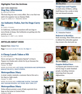
I’m surprised to find “hot dogs” as the top two “articles about dogs”, after some nice featured content. NYTimes may also want to refine handling of multiword terms.

Hot dogs turn up in dogs

Hot dogs turn up in dogs

Another example is “Baby Quasar(Skin Care Devise)” showing up under quasars.

By versus About

Times writers (e.g. Tom Zeller Jr.) are listed in italics and classified as people. The ‘by’ versus ‘about’ distinction is made primarily in meta tags. “PSST” seems to identify Times writers.For instance, compare the meta tags from Tom Zeller Jr’s page:

<meta name=”PT” content=”Topic” />
<meta name=”CG” content=”Times Topics” />
<meta name=”GTN” content=”Zeller, Tom Jr.” />
<meta name=”PST” content=”People” />
<meta name=”PSST” content=”Writer” />

to those on (non-Times) writer Toni Morrison’s page:

<meta name=”PT” content=”Topic” />
<meta name=”CG” content=”Times Topics” />
<meta name=”GTN” content=”Morrison, Toni” />
<meta name=”PST” content=”People” />
<meta name=”SCG” content=”The Public Editor” />

Final thoughts

The world of electronic publishing blurs the lines between producers and indexers. Archival content, served up by organization, person, or topic, is a great offering. The secondary publishing market (abstracting, indexing, etc.) is changing quickly. Source-based browsing, as at NYTimes Topics, is part of that change.

Tags: , , , ,
Posted in old newspapers, reviews | Comments (2)

Ubiquity

August 29th, 2008

Backing up my ginormous Zotero library was something of a deterrent, so I didn’t install Firefox 3 until Ubiquity (Introducity Ubiquity, Mozilla Labs) (Ubiquity Firefox Plugin) piqued my curiosity.

At first glance, Ubiquity strikes me as Quicksilver for the Web. I suspect it will be much more.

Ubiquity Contextual MenuInstall a single plugin, then summon Ubiquity’s command box with a keysequence. You can also use a contextual menu (right). Pre-installed commands are sorted in order of expected use. ‘Tag’ uses Firefox’s local tagging capability. To add delicious bookmarks, you could try delicious plugin code from Ryan Sonnek.

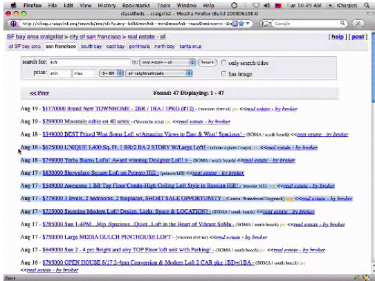
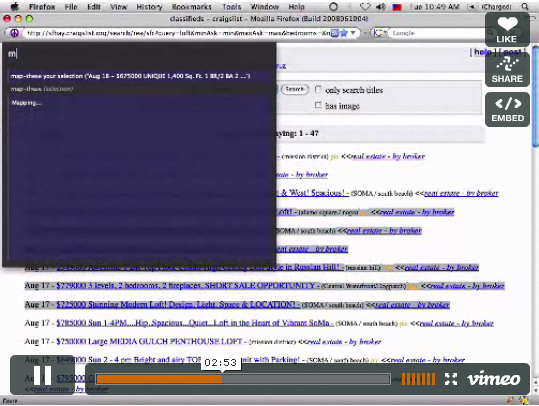
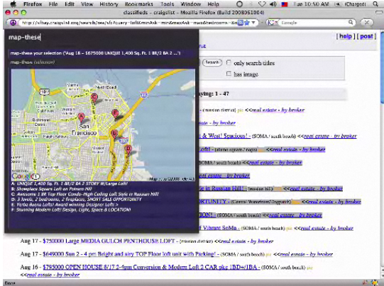
Aza Raskin’s Ubiquity Intro Video gives a sense of the current capabilities. For instance, Example #2 shows that highlighting Craigslist apartment listings and invoking ‘map these’ generates a map of the listings.

Step 1: Highlight Craigslist apartment listings

Step 1: Highlight Craigslist apartment listings

Step 2: Invoke Ubiquity's 'map-these' command

Step 2: Invoke Ubiquity's 'map-these' command

Step 3: Voila! Mapped listings. (Less clicking, more mapping!)

Step 3: Voila! Mapped listings. (Less clicking, more mapping!)

Nice, eh? Go try Ubiquity. Or, if you want to read more first, there are plenty of options:

Ubiquity Info for Users: Mozilla Labs Post | User Tutorial

More: Extra Commands | Ubiquity Herd (Stats/Dashboard) | Support/Discussions | post from Aza Raskin’s personal blog

Ubiquity Info Developer Links: Author Tutorial | Source Code | Google Group | Wishlist | Labs Wiki

Tags: , , , , ,
Posted in Firefox, reviews | Comments (1)

Shakespeare iphone app

August 16th, 2008

After seeing a great local production, I decided to reread As You Like It. Before I got around to digging out my Complete Works of Shakespeare, I got a copy for my iphone.

Reading on the iphone was a satisfying experience. The screen is crisp and paging down through the text becomes automatic. Just tap in the lower third of the screen. (Paging up is not enabled, but the upper 2/3rds of the screen allow scrolling up or down.)

I prefer reading in landscape mode:

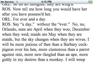
Formatting of Shakespeare’s verse can be awkward in horizontal mode:

App name: Shakespeare[appstore]
Maker:
Readdle
Cost:
free
Bugs:
Beware of losing your place when changing between landscape and horizontal screen modes. Pagination routines need to be updated.
Quirks:

  • Navigation and font size selection are only available in the horizontal screen mode.
  • Landscape mode is supported only within a text; it is not supported in the main, about, or help screens.

Features: 10 font sizes, changed by tapping buttons in horizontal screen mode. Navigating down through a text is easy: tap on the lower third of the screen.

Other reviews: A video overview starts at 1:18 of this T4 videopodcast.

Tags: ,
Posted in books and reading, iOS: iPad, iPhone, etc., reviews | Comments (1)