Archive for the ‘iOS: iPad, iPhone, etc.’ Category

Annotation summaries: standardization needed

August 4th, 2011

I’m finding an iPad amazing for reading PDFs — it’s like instant printing, with no weight to carry around (heavy, and they get wet). And with software like iAnnotatePDF and GoodReader, I can annotate with just a bit more effort than while using pen and paper.

iAnnotate (video review) is the killer app that convinced me to buy an iPad. But it has a killer flaw: I couldn’t keep my reading organized with it.

Hence I started looking into reference managers that would work well on the iPad–allowing annotation, making it easy to keep PDF’s organized, and ensuring that annotations were kept in a sensible place.

Sente fulfills many of my requirements. Sync seems to work effortlessly — well exceeding my experience with other products. The annotation process is reasonably smooth but so far I haven’t found a way to export annotations directly.

This is a bit problematic because PDF editors don’t seem to play nice with each others’ annotations. For instance, iAnnotate and GoodReader both export annotations for their own software. You get something very useful and readable like this:

Page 1, Highlight (Yellow):
Content: “The scientific use of Twitter has received some attention in previous work: [4] and [5] have performed several automatic analyses of tweets collected for different conference hashtags, including for example time series and lists of most active twitterers. [3] and [9] have furthermore carried out manual analyses of tweet contents for conference tweet datasets to determine, what conference participants are tweeting about. [10] are develop ing automatic methods for extracting semantic information from conference tweets. [6] have focused on tweets published by a set of manually identified scientists and have investigated their citation behavior.”

Page 1, Highlight (Yellow):
Content: “citations and references are two sides of the same coin.”

But when you annotate in one program and get notes from another program, things get messier.

For PDFs annotated externally, iAnnotate lists highlights without only grabs text from the notes, like this:

Page 1, Highlight (Custom Color: #fdf7bc):

Page 2, Highlight (Custom Color: #fdf7bc):

Page 2, Note (Custom Color: #fdffaa):
Not sure why this stands out from other lists by individuals.

GoodReader plays a bit nicer with annotations from other programs: it breaks annotations made by other programs at line boundaries. This makes summaries a little difficult to read, but at least there’s some content:

Highlight (color #FDF7BC):
first of all it will have to start with the general problem in

Highlight (color #FDF7BC):
analyzing scientific impact of Twitter:

Highlight (color #FDF7BC):
[6] define

Highlight (color #FDF7BC):
tweet to a peer-U

I’m currently checking into the standardization around annotations summaries.

I’d be very interested to hear about how you detect metadata and annotation differences in PDFs. As examples, I’ve marked up a recent WebSci poster, with some annotations from GoodReader, from iAnnotatePDF, and from Sente.
Tags: , , ,
Posted in books and reading, iOS: iPad, iPhone, etc. | Comments (1)

Annotating PDFs on an iPad: GoodReader and iAnnotatePDF

July 31st, 2011

Colleagues were interested in my recommendations for iPad annotation: GoodReader and iAnnotatePDF. Here’s a brief comparison.

Both save Acrobat-compatible annotations, which can be exported out as text (for instance to see everything you’ve highlighted yellow), offer synching, and multiple styles of annotation. The exact annotation workflow and navigation differ somewhat.

GoodReader’s main strength is the ability to easily pinpoint the exact boundaries of an annotation: a circular magnifying ‘loope’ window automatically pops up. GoodReader also warns you when scanned images don’t have text behind them (offering to OCR them would be a welcome, though challenging enhancement: it would be enough to put them into an OCR-queue you could have Acrobat Pro watch and act on). One weakness (for me at least) is that to get the toolmenu, you must tap in the middle of the screen. My fingers seem expect it to pop up when you tap on the right-hand side of the screen: sometimes that advances the page, but sometimes that just changes the view on the current page. Further, I find its small black-and-white icons somewhat confusing.

I prefer iAnnotatePDF, especially because it saves annotations by default, has customizable navigation, and clearer icons. Its key strength is that annotations are auto-saved, with ‘undo’, ‘delete’, and ‘edit’ functions. Further, the annotation type is maintained between annotations, until you (say) put down the highlighter by clicking an x. This is a small weakness since I find that to switch pages I have to close the annotation tool I’m currently using. Another weakness is that there’s a limited time window for editing existing annotations: just after they are created, annotations can be adjusted, for instance to move the boundaries of text highlights and underlines. Yet after this period has expired, annotations can be deleted, but locations cannot be adjusted (as far as I can tell). Another weakness is that interacting with image-only PDFs can be confusing; without any text, some functions (text highlight, text underline, …) just don’t work, without any warning or notice.

I would be interested in hearing comparisons of the syncing functionality, as well as comparisons to PDFExpert.

Criterion  GoodReader  iAnnotatePDF 
Pageview  default is snap to page (double-spreads show left-to-right)  flow (can see parts of 2 pages at once, top-to-bottom) 
Saving annotations  Must save each annotation  Annotations automatically save 
Navigation  tap left/right to navigate forward/back; scroll only shows the same page  tap, slide, or swipe to navigate (customizable)  
Toolbar  tap in the middle  tap on the right 
Icons  black & white, some are obscure   medium-sized color, some are clearly understandable  

Posted in books and reading, iOS: iPad, iPhone, etc. | Comments (1)

How do you organize papers on your iPad?

July 31st, 2011

You read papers, right? How do you store and organize them? I’m looking for advice on a workflow for annotating PDFs and syncing between devices.

I’m striking out on iPad apps for organizing scholarly papers. Papers2 doesn’t pull annotated copies back. Mendeley lite doesn’t even let me log in ((In Mendeley v1.3.1 (build 19) when I enter my login details, the only option is ‘close’. After closing, Mendeley reports “Not logged in”. Yes, I’ve double-checked my password!)). Zotero, which has been my main reference manager for at least 5 years, doesn’t offer an iPad app.

For annotation, I like iAnnotatePDF and GoodReader (and I’m getting ready to try PDFExpert). What I don’t know is how to have manageable filenames, when the documents originate in another iPad app, instead of on the desktop.

The only ideas I have left involve either spending more time with filemanagers or relying on the synching inside the annotation tools.

Reference managers/PDF managers:

  1. Try Sente
  2. See what DevonThink Pro Office can do, maybe with Zotero export others have worked on. Surely that’s overkill?

Synching from annotation tools:

iAnnotate or GoodReader can “watch” folders. Main challenge is going to be coming up with a sufficiently small collection of PDFs to sync back and forth to the iPad.

  1. Stick with Zotero, maybe with files renamed from Zotfile, then use iAnnotatePDF’s “watch folder” feature to keep in sync.
  2. Stick with Papers2, manually manage the file synch for everything I’ve annotated, then use watch its data directory with iAnnotatePDF as above.
  3. Try Mendeley, watch its data directory with iAnnotatePDF as above.

Thoughts and suggestions? What would you do?

Posted in books and reading, iOS: iPad, iPhone, etc. | Comments (1)

Papers2 does not integrate with external iPad applications in the way I expected

July 31st, 2011

Papers2 does not integrate with external iPad applications in the way I expected. I use iPad applications like GoodReader, iAnnotatePDF, and PDFExpert to read and annotate papers.

The functionality I expected was:

  • Export from Papers to an external PDF annotation application
  • When I reopen Papers, the annotated PDF is shown in my library

However, here is what happens:

  • Export from Papers to an external PDF annotation application. It renames the file, using a random string as the filename.
  • When I reopen Papers, only the original (unannotated) PDF is in my library.
  • Alternately when I export from the external application, the annotated file is imported as a *new* PDF, unconnected to the original, with a random string used for the filename.

I started using Papers because managing filenames in iAnnotate wasn’t working: I couldn’t figure out which files were which. So this is absolutely key for me.

==

This is a bug report to Papers2, copied here since bug reports are private. Any workarounds or suggestions for alternate annotation/reference management workflows would be very welcome.

This annotation environment completely failed to meet my expectations: I expected to ‘Open In’ an annotation application; in fact there’s just ‘Export’ and ‘Import’, meaning that the annotated file isn’t automatically stored in the Papers2 library.

Tags: , , , , , , ,
Posted in books and reading, iOS: iPad, iPhone, etc. | Comments (1)

Apple seizes control of iOS purchase chain: enforces 30% cut for Apple by prohibiting sales-oriented links from apps to the Web

February 16th, 2011

Apple’s press release about its “new subscription services” seems at first innocuous, and the well-crafted quote ((

“Our philosophy is simple—when Apple brings a new subscriber to the app, Apple earns a 30 percent share; when the publisher brings an existing or new subscriber to the app, the publisher keeps 100 percent and Apple earns nothing,” said Steve Jobs, Apple’s CEO. “All we require is that, if a publisher is making a subscription offer outside of the app, the same (or better) offer be made inside the app, so that customers can easily subscribe with one-click right in the app. We believe that this innovative subscription service will provide publishers with a brand new opportunity to expand digital access to their content onto the iPad, iPod touch and iPhone, delighting both new and existing subscribers.”

– Steve Jobs at “Apple Launches Subscriptions on the App Store“)) from Steve Jobs has been widely reposted:
“when Apple brings a new subscriber to the app, Apple earns a 30 percent share; when the publisher brings an existing or new subscriber to the app, the publisher keeps 100 percent and Apple earns nothing.” Yet analysts reading between the lines have been less than pleased.

Bad for publishers

The problems for publishers? (See also “Steve Jobs to pubs: Our way or highway“)

  • Apple takes a 30% cut of all in-app purchases ((Booksellers call this “the agency model“.))
  • Apps may not bypass in-app purchase: apps may not link to an external website (such as Amazon) ((Apple has confirmed that Kindle’s “Shop in Kindle Store” must be removed.)) that allows customers to buy content or subscriptions.
  • Content available for purchase in the app cannot be cheaper elsewhere.
  • The customer’s demographic information resides with Apple, not with the publisher. Customers must opt-in to share their name, email, and zipcode with the publisher, though Apple will of course have this information.
  • Limited reaction time; changes will be finalized by June 30th.

Bad for customers?

And there are problems for customers, too.

  • Reduction of content available in apps (likely for the near-term).
  • More complex, clunky purchase workflows (possible).
    Publishers may sell material only outside of apps, from their own website, to avoid paying 30% to Apple. Will we see a proliferation of publisher-run stores?
  • Price increases to cover Apple’s commission (likely).
    If enacted, these must apply to all customers, not just iOS device users.
  • Increased lockdown of content in the future (probably).
    Apple already prevents some iBooks customers from reading books they bought and paid, using extra DRM affecting some jailbroken devices. Even though jailbreaking is explicitly legal in the United States. And even though carrier unlock and SIM-free phones are not available in the U.S.

More HTML5 apps?

The upside? Device-independent HTML5 apps may see wider adoption. HTML5 mobile apps work well on iOS, on other mobile platforms, and on laptops and desktops.

For ebooks, HTML5 means Ibis Reader and Book.ish. For publishers looking to break free of Apple, yet satisfy customers, Ibis Reader may be a particularly good choice: this year they are focusing on licensing Ibis Reader, as Liza Daly’s Threepress announced in a savvy and well-timed post, anticipating Apple’s announcement. Having been a beta tester of Ibis Reader, I can recommend it!

If you know of other HTML5 ebook apps, please leave them in the comments.

Tags: , , , , , , , , , , , , , , ,
Posted in books and reading, future of publishing, information ecosystem, iOS: iPad, iPhone, etc. | Comments (0)

Locative texts

June 13th, 2010

A post at HLit got me thinking about locative hypertexts, which are meant to be read in a particular place.

Monday, Liza Daly shared an epub demo which pulls in the reader’s location, and makes decisions about the character’s actions based on movement. Think of it as a choose-your-own-adventure novel crossed with a geo-aware travel guide. It’s a brief proof-of-concept, and the most exciting part is that the code is free for the taking under the very permissive (GPL + commercial-compatible) MIT License. Thanks, Liza and Threepress for lowering barriers to experimentation with ebooks!

‘Locative hypertexts’ also bring to mind GPS-based guidebooks as envisioned in the 2007 Editus video ‘Possible ou probable…?’ ((Editus’ copy of the video)):

Tim McCormick summarizes:

In the 9-minute video, we get mouth-watering, partly tongue-in-cheek scenes of continental Europe’s quality-of-life — fantastic trains & pedestrian streetscapes,independent bookstores, delicious food, world-class museums, weekend getaway to Bruges, etc.– as the movie follows a couple through a riotous few days of E-book high living.

On their fabulously svelte, Kindle 2-like devices, they

  • read and purchase novels
  • enjoy reading on the beach
  • get multimedia museum guides
  • navigate foreign cities with ease
  • stay in multimedia contact with friends and family
  • collaborate with colleagues on shared virtual desktops while at sidewalk cafes
  • see many hi-resolution Breughel paintings online and off that I’m dying to see myself

etc.

Multimedia guidebooks ((e.g. the Lonely Planet city guide series for iPhone)) are approaching this vision. Combine them with (also-existing) turn-by-turn directions, and connectivity and privacy will be the largest remaining obstacles.

So then what about location-based storytelling? I got to thinking about the iPhone apps I’ve already encountered, which are intended for use in particular places:

  • Walking Cinema: Murder on Beacon Hill – a murder mystery/travel series based in Boston (available as an iPhone app and podcast).
  • Museum of the Phantom City: Other Futures – a multimedia map/alternate history of NYC architecture, described as a way to “see the city that could have been”. It maps never-built structures envisioned by Buckminster Fuller, Gaudi, and others – ideally while you’re “standing on the projects’ intended sites”.
  • Museum of London: Streetmuseum, true history of London in photos, meant for use on the streets
  • Historic Earth, has historical maps which could be interesting settings for historical locative storytelling

Tags: , , ,
Posted in books and reading, future of publishing, information ecosystem, iOS: iPad, iPhone, etc. | Comments (0)

Amplify your conference with an iPhone app

March 26th, 2010

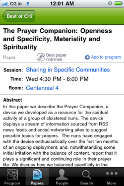
via Gene Golovchinsky, I learned of an iphone app for CHI2010. What a great way to amplify the conference! Thanks to Justin Weisz and the rest of the CMU crew.

I was happy to browse the proceedings while lounging. The papers I mark show up in my personal schedule and in a reading list.

Paper viewPersonalized conference schedule, generated from my selections
I think it’s an attractive alternative to making a paper list by hand, using some conferences’ clunky online scheduling tool, or circling events in large conference handouts. If you keep an iPhone/iPod in your pocket, the app could be used during the conference, but I might also want to print out my sessions on an index card. So exporting the list would be a good enhancement: in addition to printing, I’d like to send the list of readings directly to Zotero (or another bibliographic manager).

The advance program embedded on the conference website still has some advantages: it’s easier to find out more about session types (e.g. alt.chi). Courses and workshops stand out online, too.

map of conference locationssearching the proceedings

Wayfinding is hard in on-screen PDFs, so I hope that in the long run scholarly proceedings become more screen-friendly. While at present I find an iPhone appealing for reading fiction, on-screen scholarly reading is harder: for one thing, it’s not linear.

I’d like to see integrated, reader-friendly environments for conference proceedings, with full-text papers. I envision moving seamlessly between the proceedings and an offline reading environment. Publishers can already support offline reading on a wide variety of smartphones: the HTML5-based Ibis Reader uses ePub, a standard based on xHTML and CSS. There’s no getting around the download step, but an integrated environment can be “download first, choose later”. I’ve never had much luck with CD-ROM and USB-based conference proceedings, except in pulling off 2-3 PDFs of papers to read later.

Tags: , , , ,
Posted in future of publishing, information ecosystem, iOS: iPad, iPhone, etc., scholarly communication | Comments (0)

Penguin US iphone app, and some thoughts on ebooks for iPhone

December 27th, 2008

Penguin recently put out an iPhone app. It’s one part browser, one part ereader. It’s a reasonable start, but it feels rough around the edges. While I may try a later version, I’m deleting this app for now. I’d rather see publishers using existing ereaders and browsers, rather than building their own—especially for title sales, which they say is coming.

While I’m sure that the Penguin2.0 team is doing the best with what they have, they would do well to focus on getting in the flow, rather than trying to be a destination. Get listed by existing mobile ereader software: treat iPhone’s Stanza, Ereader, and BookZ and other ereaders as intermediate consumers.

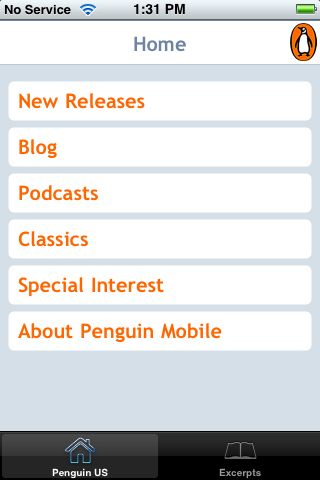
On to the details. The Penguin US app presents an array of options:

In fact, this page presents Penguin’s mobile site in their custom browser. (Note: to keep entry point URIs short, choose m, rather than mobile, for the subdomain.) Italics indicate suggestions from W3C mobile web best practices.

“Special Interest” may be an industry term, but I doubt it’s meaningful to most consumers (clarity). (It ranges from “African American” to “Short Reads”, and includes, for instance, “Current Affairs” and “Parenting”, BTW.)

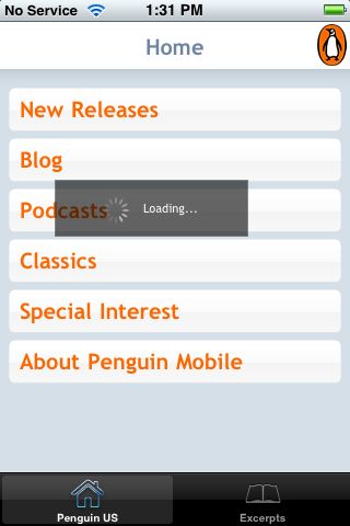
Loading is v-e-r-y slow, even on wireless, going to subscreens… (Use the network sparingly.)

It’s slow going back home, too. (Are they providing caching information?) (Note 3 ways to get home from this screen: Besides the breadcrumb labeled ‘home’, and the global navigation in the lower left, the penguin icon in the upper right links to home. Cute, however provide only minimal navigation at the top of the page.)

Limit scrolling to one direction. Unfortunately, there’s quite a bit of whitespace in the margins.


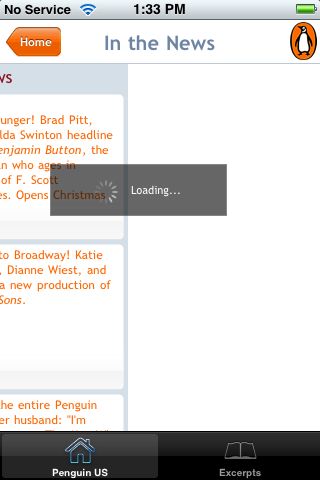
This is the Classics page (scrolled overfar). The books themselves are at the bottom of this page (clarity, central meaning). I felt a bit disoriented at first, because news about classic titles is at the top of the page (e.g. Benjamin Button, a new production of All My Sons).

Podcasts sound great (capabilities). However, they do tie up the device (deficiencies).


The blog is not optimized for mobile viewing. For instance, there are missing plugins(deficiencies).


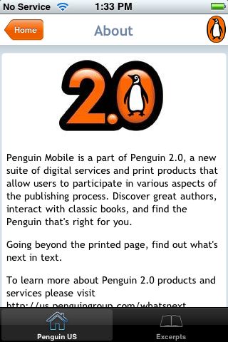
I’m sad that the Penguin Mobile ‘about’ page is just half a line overfull. (A pet peeve, clearly!) Perhaps the designers forgot about the service bar? Or tested in Safari (whose back button is smaller than the Penguin global navigation)? (testing)


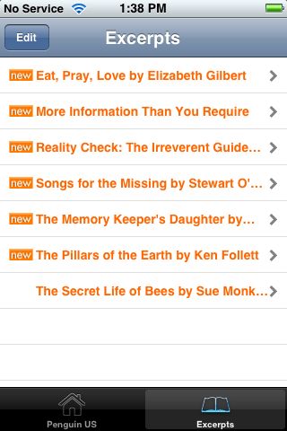
It’s not all bad: Excerpts are always available, even without an internet connection. And I find this next screen charming: well-done!


In listing excerpts, they do keep with the color theme!


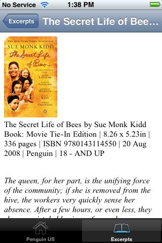
Excerpts start with a cover image and book information, pulled straight from a catalog, I presume. (limited, suitable) Tweaking formatting could make this more compact, with a more prominent title to next to, rather than below the cover image:


Scroll down to get to the first chapter:

It will be interesting to see how other publishers respond to the iPhone as an ebook platform. The Stanza free ereader for iPhone, for instance, currently has two publisher listings at the top of its online catalog: “Free Harlequin Love Stories” (4 novellas) as well as “Random House Free Library” (currently 9 recent titles, ranging from backlist massmarkets to summer and fall hardcover releases). Pan Macmillan (UK) is offering titles for purchase.

App name: Penguin US [appstore]
Maker: Penguin Group USA, web2.0
Cost: free
Quirks: Pages behave as fixed-width when zooming. Odd handling of double taps. Full-width is not used for excerpts in landscape mode.
Features: Free excerpts. Easy access to Penguin podcasts.

Posted in books and reading, iOS: iPad, iPhone, etc., reviews | Comments (0)

La Divina Commedia

November 29th, 2008

La Divina Commedia is another simple ebook application for the iPhone. Like Shakespeare, it provides free access to a classic read in its original language.

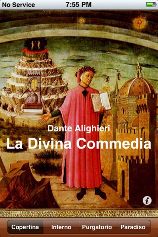
An attractive screen greets the reader:

Appropriately, it’s Domenico di Michelino‘s painting, Dante e suo poema (“Dante and his poem”).

Navigation is simple and straightforward, and mirrors the division of The Divine Comedy. Choose a canticle—Inferno, Purgatorio, or Paradiso—to get to Canto I of that section of the poem. Within each canto, scroll up and down (using default iphone behavior—there are no options or settings). Use arrow keys at the top right to get to the next (or previous) canto in the same section.

An info screen, accessible from the cover screen, gives credits:

If you ignore scrolling, that’s 102 screens!

App name: La Divina Commedia [appstore]
Maker: Stefano Sanna
Cost: free
Bugs: none found
Quirks: To navigate to a canto, you must scroll through the previous cantos; there’s no. Dante scholars often prefer to treat the first canto as introductory, and not part of the Purgatorio, making each canticle a neat 33 cantos. While scrolling follows iphone conventions, there is no scrolling; that limits the usability, especially if the font size doesn’t suit.
Features: A solid, free text of Dante’s famous work.
Other reviews: See comments at http://www.iphoneos.it/?p=3

Tags: , , ,
Posted in books and reading, iOS: iPad, iPhone, etc., reviews | Comments (0)

Shakespeare iphone app

August 16th, 2008

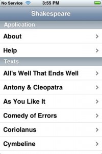
After seeing a great local production, I decided to reread As You Like It. Before I got around to digging out my Complete Works of Shakespeare, I got a copy for my iphone.

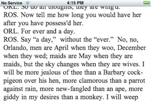
Reading on the iphone was a satisfying experience. The screen is crisp and paging down through the text becomes automatic. Just tap in the lower third of the screen. (Paging up is not enabled, but the upper 2/3rds of the screen allow scrolling up or down.)

I prefer reading in landscape mode:

Formatting of Shakespeare’s verse can be awkward in horizontal mode:

App name: Shakespeare[appstore]
Maker:
Readdle
Cost:
free
Bugs:
Beware of losing your place when changing between landscape and horizontal screen modes. Pagination routines need to be updated.
Quirks:

  • Navigation and font size selection are only available in the horizontal screen mode.
  • Landscape mode is supported only within a text; it is not supported in the main, about, or help screens.

Features: 10 font sizes, changed by tapping buttons in horizontal screen mode. Navigating down through a text is easy: tap on the lower third of the screen.

Other reviews: A video overview starts at 1:18 of this T4 videopodcast.

Tags: ,
Posted in books and reading, iOS: iPad, iPhone, etc., reviews | Comments (1)