These days my main foray into reference territory is when my colleagues are looking for things.
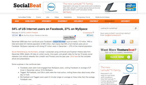
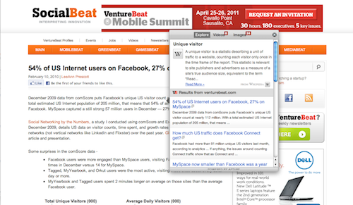
While looking for an update on some social media statistics, I encountered a “get more info” interface that didn’t annoy me, at VentureBeat.
When you highlight text (and only when you highlight text), a small, “Learn More” balloon appears. When you click “Learn More” (and only when you click “Learn More”), further info appears.


When debating whether to include more information or less, this strategy deserves consideration.
It reminds me of Barend Mons’ derisive phrase a Christmas tree of hyperlinks; while he was mainly referencing the lack of information, I also imagine in that phrase the reader’s overwhelm when everything is hyperlinked.
There is, of course, a tradeoff, between hiding information/requiring clicks and presenting everything at once.