Penguin recently put out an iPhone app. It’s one part browser, one part ereader. It’s a reasonable start, but it feels rough around the edges. While I may try a later version, I’m deleting this app for now. I’d rather see publishers using existing ereaders and browsers, rather than building their own—especially for title sales, which they say is coming.
While I’m sure that the Penguin2.0 team is doing the best with what they have, they would do well to focus on getting in the flow, rather than trying to be a destination. Get listed by existing mobile ereader software: treat iPhone’s Stanza, Ereader, and BookZ and other ereaders as intermediate consumers.
On to the details. The Penguin US app presents an array of options:
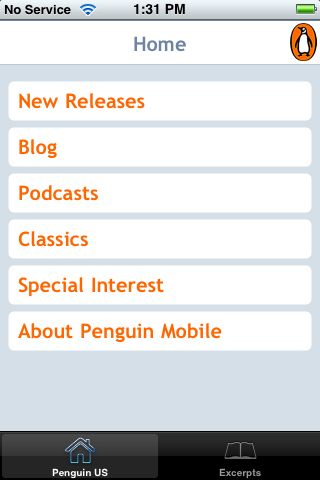
In fact, this page presents Penguin’s mobile site in their custom browser. (Note: to keep entry point URIs short, choose m, rather than mobile, for the subdomain.) Italics indicate suggestions from W3C mobile web best practices.
“Special Interest” may be an industry term, but I doubt it’s meaningful to most consumers (clarity). (It ranges from “African American” to “Short Reads”, and includes, for instance, “Current Affairs” and “Parenting”, BTW.)
Loading is v-e-r-y slow, even on wireless, going to subscreens… (Use the network sparingly.)
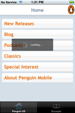
It’s slow going back home, too. (Are they providing caching information?) (Note 3 ways to get home from this screen: Besides the breadcrumb labeled ‘home’, and the global navigation in the lower left, the penguin icon in the upper right links to home. Cute, however provide only minimal navigation at the top of the page.)
Limit scrolling to one direction. Unfortunately, there’s quite a bit of whitespace in the margins.
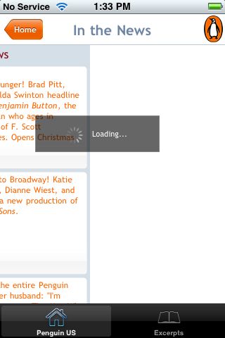
This is the Classics page (scrolled overfar). The books themselves are at the bottom of this page (clarity, central meaning). I felt a bit disoriented at first, because news about classic titles is at the top of the page (e.g. Benjamin Button, a new production of All My Sons).
Podcasts sound great (capabilities). However, they do tie up the device (deficiencies).

The blog is not optimized for mobile viewing. For instance, there are missing plugins(deficiencies).

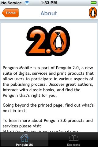
I’m sad that the Penguin Mobile ‘about’ page is just half a line overfull. (A pet peeve, clearly!) Perhaps the designers forgot about the service bar? Or tested in Safari (whose back button is smaller than the Penguin global navigation)? (testing)
It’s not all bad: Excerpts are always available, even without an internet connection. And I find this next screen charming: well-done!

In listing excerpts, they do keep with the color theme!

Excerpts start with a cover image and book information, pulled straight from a catalog, I presume. (limited, suitable) Tweaking formatting could make this more compact, with a more prominent title to next to, rather than below the cover image:

Scroll down to get to the first chapter:

It will be interesting to see how other publishers respond to the iPhone as an ebook platform. The Stanza free ereader for iPhone, for instance, currently has two publisher listings at the top of its online catalog: “Free Harlequin Love Stories” (4 novellas) as well as “Random House Free Library” (currently 9 recent titles, ranging from backlist massmarkets to summer and fall hardcover releases). Pan Macmillan (UK) is offering titles for purchase.
App name: Penguin US [appstore]
Maker: Penguin Group USA, web2.0
Cost: free
Quirks: Pages behave as fixed-width when zooming. Odd handling of double taps. Full-width is not used for excerpts in landscape mode.
Features: Free excerpts. Easy access to Penguin podcasts.